Since Distant Shore Publishing started taking on short stories, we’ve been overwhelmed by the sheer variety of stories and skilfulness of the writers submitting. It wasn’t long until we thought to compile some select stories – and some newcomers! – into a science fiction anthology for everyone to enjoy.
Once the anthology got its title and the stories were selected, it was time to think of cover ideas.
We gave our cover artist, Katie Barrett, the brief: a science fiction book cover that stood out from the rest. Whilst dark space, spaceships, and shining typography seemed very popular, we wanted to do something that reflected the theme of the anthology: humanity.
Katie started by pitching three very different ideas:
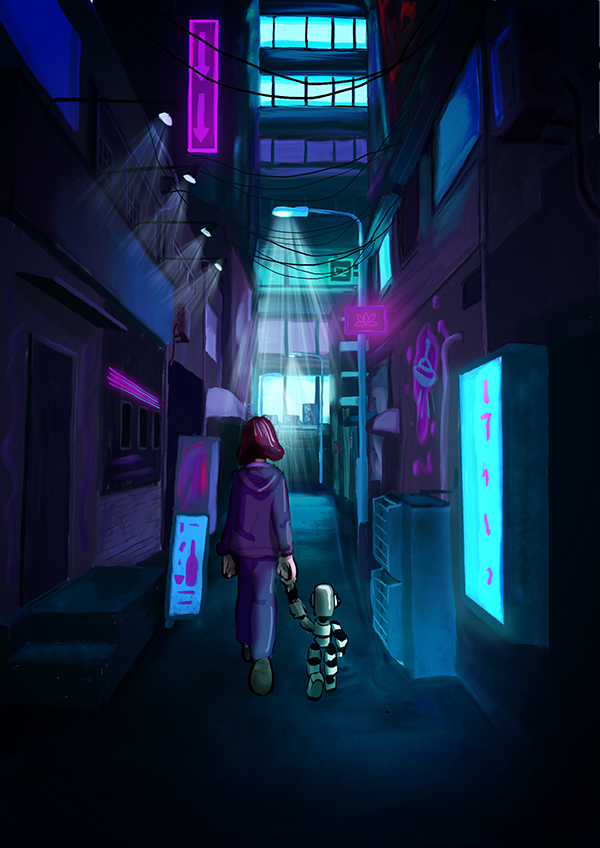
The first idea was of a neon alleyway, inspired by our latest interest in cyberpunk and the neon artwork of Syd Mead (the designer for Bladerunner). Although atmospheric, we decided it was too dark and unclear as a book cover with the topic of the book not clearly expressed.
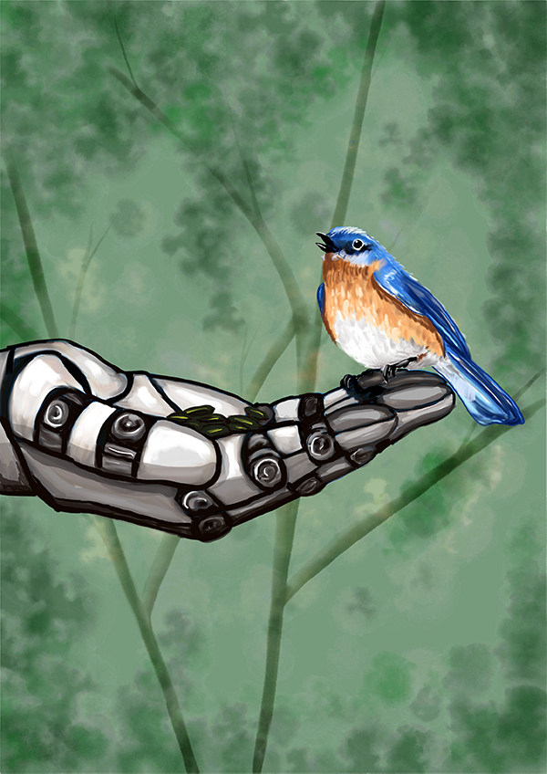
The second idea you may recognise from our latest library update, The Maker’s are Remembered. This lovely, delicate bird perches on the hand of a robot. A poignant take on the delicacy of nature and its conflict with technology, we felt the concept of humanity was not put across as much as it could be.
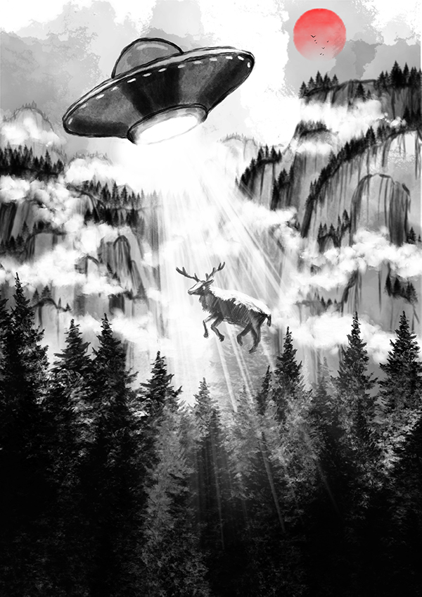
The third idea you’ll definitely recognise. A stag being taken up by a UFO had an atmospheric quality and a bizarreness that was truly – well – uncanny. It subtly conveyed humanity’s unchallenged draw to the unknown and technology, lifted from its home and taken to new heights we cannot yet comprehend.
Once we had chosen the initial cover idea, there were a a few things that needed to be added:
– Title
– Subtitle
– Authors
– Space for tagline or quote

We started off by selected a clear and eye-catching title font. This red one with black stripes gives a feel of depth and atmosphere, the red colour stark against the black and white of the background.
We tried two different versions to highlight the numerous contributors involved, one made centre and one positioned on the right.
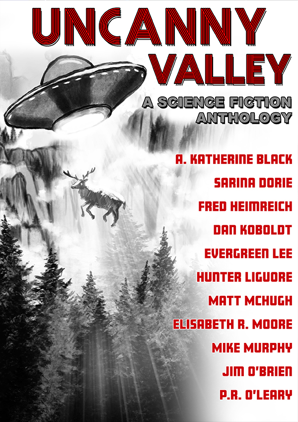
Because the artwork said so much by itself, we were tempted by the simplicity of leaving the authors off the main page. Having researched other anthologies, we found this was something a lot of other publications did. This allowed the cover to speak for itself, whilst also adding a layer of mystery that would intrigue the reader to pick it up.
Once we had decided to simplify the cover, we explored what was the central concept that we liked most and would want to highlight in the final design. Was it the text? The stag? The UFO? What was meant to be the central figure and what did readers like the most?
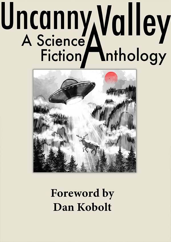
This design played making the typography more dominant and the artwork more contained. By squaring it off and leaving a blank space around it, the viewer was drawn more to the title than the image. This design was rejected for being too simple and not showcasing the artwork to its full potential.

Although very close to the cover you know and love today, the difference is the fade down from the title. This softer separation was later changed into a starker contrast, that looked better as a thumbnail as our books are only published digitally.

This design cleared out the fog and mountains and made the title take up half the cover space. Putting a fade on the design made you read the title first rather than looking at the image. This was also rejected for taking away what made the cover initially mesmerising – its stag and the UFO.
THE
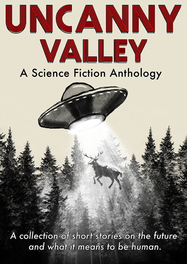
And there you have it!
The final design had some font changes and a tagline added. The UFO and stag rightfully took centre stage, with the title hovering above like an omniscient omen.
What strange adventures into the human condition await? You can find out here.
Get an update when we post something new when you follow us on Facebook and Twitter, or sign up to our newsletter here.

Really excellent article,
Thanks for showing the process~